Poll Accuracy in Turkish Elections
I criticized Turkish election polls a lot in the past for multiple reasons, so it is not a big surprise that my first blog post is about the performance of pollsters. (On a side note, Turkey is a country, where all major news outlets shared an election poll of samplesize ~100 based only on one village in Turkey because that village had historicaly voted close to the national vote result...) Election polls in Turkey tend to be very opaque since they generally are ordered by private parties who then share only the final results of the polls without any details on the methodolgies.
Since I do not have access to the methodologies behind the polls, I will try to demonstrate the issues that pollsters have regarding sampling through data points that are available such as sample size and polling end-date.
A few notes on the methodology I used:
The metric used to measure the accuracy of the polls is based on a squared difference:
- Let \(i\) denote the \(i^{th}\) candidate or party, \(p_i\) denote the proportion of votes won by the \(i^{th}\) party/candidate on the election day and \(\hat{p_i}\) be the prediction made by the Pollster for the \(i^{th}\) party/candidate, then the accuracy function is:
\[Q = \sum_i \left[ p_i - \hat{p_i} \right]^2\]
The data is available on Wikipedia. This post will focus on the last 3 elections: the 2018 presidential election, November 2015 parliamentary election and the june 2015 parliamentary election.
I used a non-parametric LOESS fit, unless if the trend was clealy linear, in order to show emerging trends in the data.
# Clean June 2015 data

june2015 <- as.data.frame(t(read.csv("../data/TR/2015 June election.csv",
                                     stringsAsFactors = F)), stringsAsFactors = F)
june2015[1,1] <- "Date"
colnames(june2015) <- june2015[1,]
june2015 <- june2015[-1,]

june2015$Date <- as.Date.character(june2015$Date, format="%m/%d/%y")
june2015[,2:6] <- lapply(june2015[,2:6], as.numeric)

june2015$accuracy <- c(aaply(.data = as.matrix(june2015[rep(nrow(june2015),nrow(june2015)-1),
                                                        c(-1)] -
                                                   june2015[-nrow(june2015),c(-1)])^2,
                             .margins = 1, .fun = sum), NA)
# Clean November 2015 data
November2015 <- as.data.frame(t(read.csv("../data/TR/2015 November Elections.csv",
stringsAsFactors = F)),
stringsAsFactors = F)
November2015[1,1] <- "Date"
colnames(November2015) <- November2015[1,]
November2015 <- November2015[-1,]
rownames(November2015)[1] <-"A&G"
rownames(November2015)[5] <- "Kurd Tek"
November2015$Date <- as.Date.character(November2015$Date, format="%m/%d/%y")
November2015[,2:6] <- lapply(November2015[,2:6], as.numeric)
November2015$accuracy <- c(aaply(.data = as.matrix(November2015[rep(nrow(November2015),nrow(November2015)-1),c(-1)] - November2015[-nrow(November2015),c(-1)])^2, .margins = 1, .fun = sum), NA)#Presidential polls analysis
presidential2018 <- read.csv("../data/TR/2018 elections polling.csv",
stringsAsFactors = F)
presidential2018[3,2]<- "OPTIMAR"
presidential2018[12,2] <- "Foresight"
presidential2018[13,2] <- "IYIP"
presidential2018[,3] <- replace_na(as.numeric(str_replace_all(presidential2018[,3], ",", "")),0)
presidential2018$Date <- as.Date.character(presidential2018$Date, format="%m/%d/%y")
#Presidential
presidential2018[is.na(presidential2018)] <- 0
presidential2018$accuracy <- c(NA, aaply( .data = as.matrix(presidential2018[rep(1,nrow(presidential2018)-1),4:(ncol(presidential2018)-2)] - presidential2018[2:nrow(presidential2018),4:(ncol(presidential2018)-2)])^2, .margins = 1,
.fun = sum))
accuracyPresidential <- presidential2018[-1,c(1,2,3,12)]Unusual Relationship Between Sample Size and Accuracy of Polls
One interesting trend that emerges after crunching the numbers and plotting the graph below, is that polls with smaller sample sizes are more accurate than polls with bigger sample sizes (albeit with only a small margin). However, the most disturbing revelation is that sample sizes that are neither big nor small perform considerably worse than polls with small/big sample sizes.
This is quite unusual for two reasons:
For a voting population of the size of Turkey's, a poll that would like to predict a result to a 1% accuracy with 95% confidence would need ~2500 participants. Yet, polls that have a sample size lower than ~2250 perform on average better than polls with bigger sample sizes.
Higher sample sizes can generally lead to more biased polls since it can often be hard to get a big sample that is representative of the voting population (i.e. a pollster might have an easier time getting people to share their opinion in a liberal neighborhood that might have the same size as another conservative one where voters are more reluctant to share their preferences)
These observations lead me to conclude that the questions asked by pollsters might not be neutral (i.e. they might subcosciously orient people being polled to vote for a specific answer) and that their sampling methodologies are simply not "random" (or balanced). This is the reason why we need pollsters to share more information than the sample size of their poll to predict the accuracy of a poll.
Please note that sample size data was only available for the 2018 Presidential elections
ggplot(data = accuracyPresidential[accuracyPresidential$Sample.size>0,]) +
    geom_jitter(aes(x = Sample.size, y = accuracy)) +
    geom_smooth(aes(x = Sample.size, y = accuracy, color = "LOESS fit"), fill = NA,
                method = "loess") +
    ggtitle("Presidential Elections 2018: Accuracy as a function of sample size")+ guides(color=guide_legend(title="Fit")) + xlab("Sample Size") + ylab("Accuracy") +
    theme_bw()
## `geom_smooth()` using formula 'y ~ x'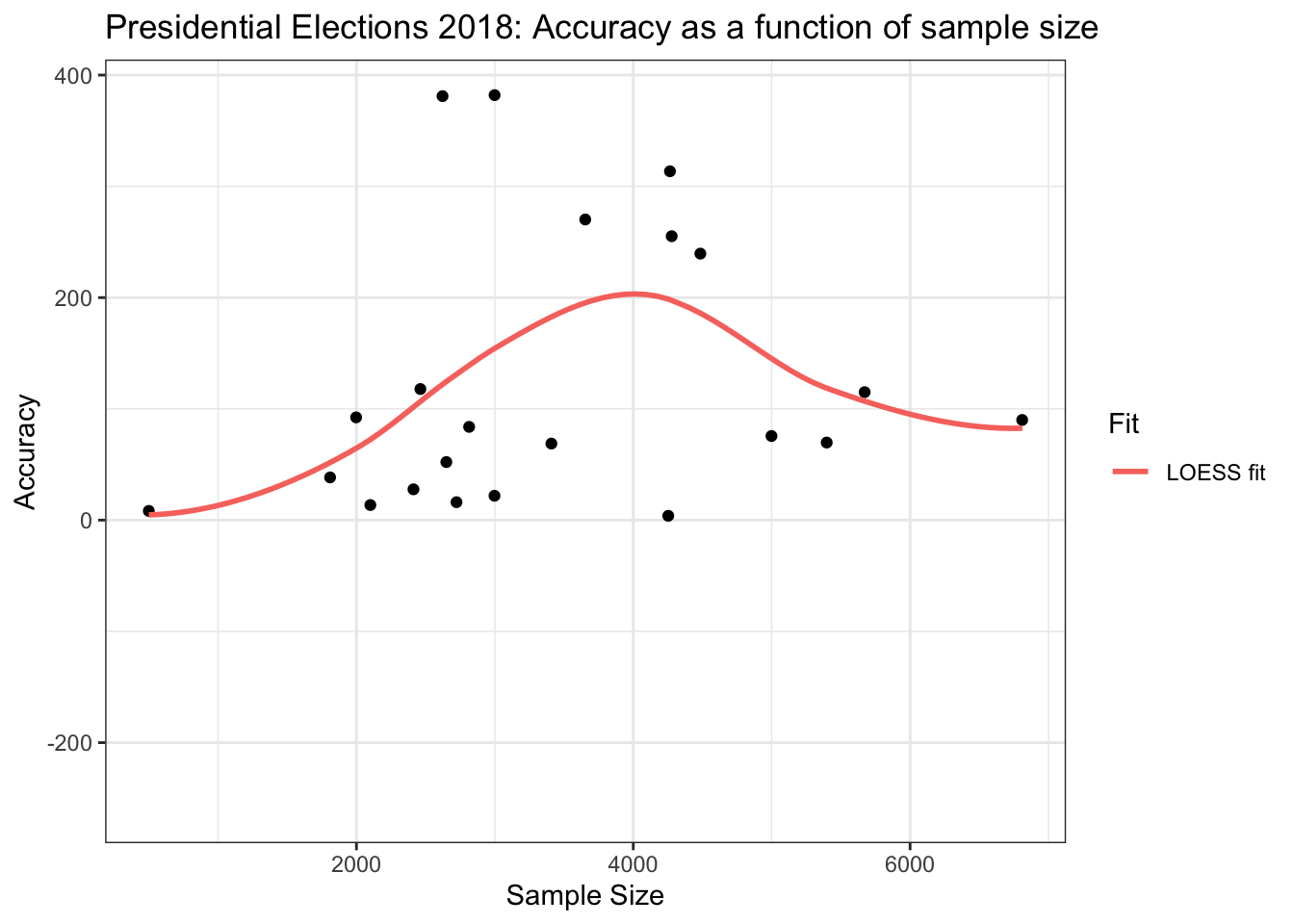
Poll Accuracy Over Time
An interesting observation that historic polling data shows us is that early polls are more successful at predicting the results than polls done in the middle of the election season. Early polls seem even to be successful at predicting the final results. However, it is hard to judge if this result is true considering our small sample size in getting to the result (furthermore, the result does not hold for the 2018 presidential elections).
Either way this observation seems to say more about Turkish voters than pollsters. That is, voters switch their position throughout the electoral season but they eventually settle for their traditional party. It will be interesting to see if this trend holds in the future since the 2018 presidential election seems to go against the trend in previous data with some voters who eventually settled for different candidates (i.e. there seems to be a linear trend in accuracy over time).
ggplot(data = accuracyPresidential) +
    geom_point(aes(x = Date, y = accuracy)) +
    geom_smooth(aes(x = Date, y = accuracy, color = "Linear fit"), fill = NA, method = "lm") +
    ggtitle("Presidential Elections: Accuracy over time")+ guides(color=guide_legend(title="Fit")) +
    xlab("Timeline (in 2018)") +
    ylab("Accuracy") +
    theme_light() +
    geom_vline(xintercept = as.Date("2018-06-24"), color = "blue", linetype = "dashed") +
    geom_label(x= as.Date("2018-06-24")-0.85, y = 500, label = "Election Day:\n 24 jun", size = 2.5) +
    xlim(c(min(presidential2018$Date),max(presidential2018$Date)))  +
    geom_hline(yintercept = 0, color = "black", linetype = "dashed")
## `geom_smooth()` using formula 'y ~ x'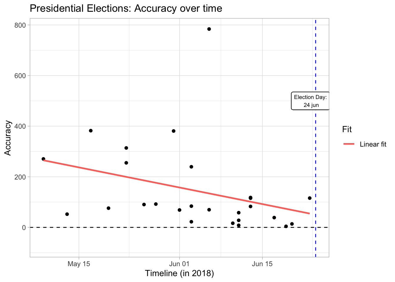
ggplot(data = November2015[-nrow(November2015),]) +
    geom_point(aes(x = Date, y = accuracy)) +
    geom_smooth(aes(x = Date, y = accuracy, color = "LOESS fit"), fill = NA, method = "loess") +
    ggtitle("November 2015 Parliamentary Elections: Accuracy over time") +
    guides(color=guide_legend(title="Fit")) + xlab("Timeline (in 2015)") +
    ylab("Accuracy") +
    geom_vline(xintercept = November2015["Election", "Date"], color = "blue", linetype = "dashed") +
    geom_label( x = November2015["Election", "Date"]-0.35, y = 150, label = "Election Day:\n 1 Nov",
                size = 2.5)  +
    xlim(c(min(November2015$Date),max(November2015$Date))) +
    theme_light()  +
    geom_hline(yintercept = 0, color = "black", linetype = "dashed")
## `geom_smooth()` using formula 'y ~ x'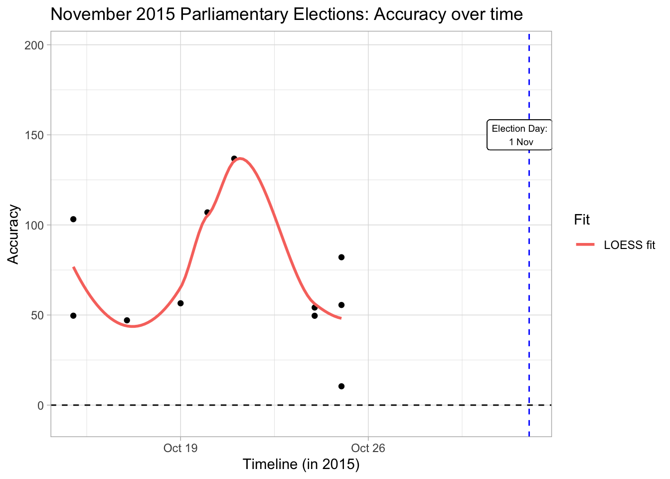
ggplot(data = june2015[-nrow(june2015),], aes(x = Date)) +
    geom_point(aes(x = Date, y = accuracy)) +
    geom_smooth(aes(x = Date, y = accuracy, color = "Linear fit"), fill = NA, method = "lm") +
    ggtitle("June 2015 Parliamentary Elections: Accuracy over time") +
    guides(color=guide_legend(title="Fit")) +
    xlab("Timeline (in 2015)") + ylab("Accuracy") +
    theme_light() +
    geom_vline(xintercept = june2015["Election", "Date"], color = "blue", linetype = "dashed") +
    xlim(c(min(june2015$Date),max(june2015$Date))) +
    geom_label(x= june2015["Election", "Date"]-0.35, y = 150, label = "Election Day:\n 7 Jun",
               size = 2.2) +
    ylim(c(-20,150))+
    geom_hline(yintercept = 0, color = "black", linetype = "dashed")
## `geom_smooth()` using formula 'y ~ x'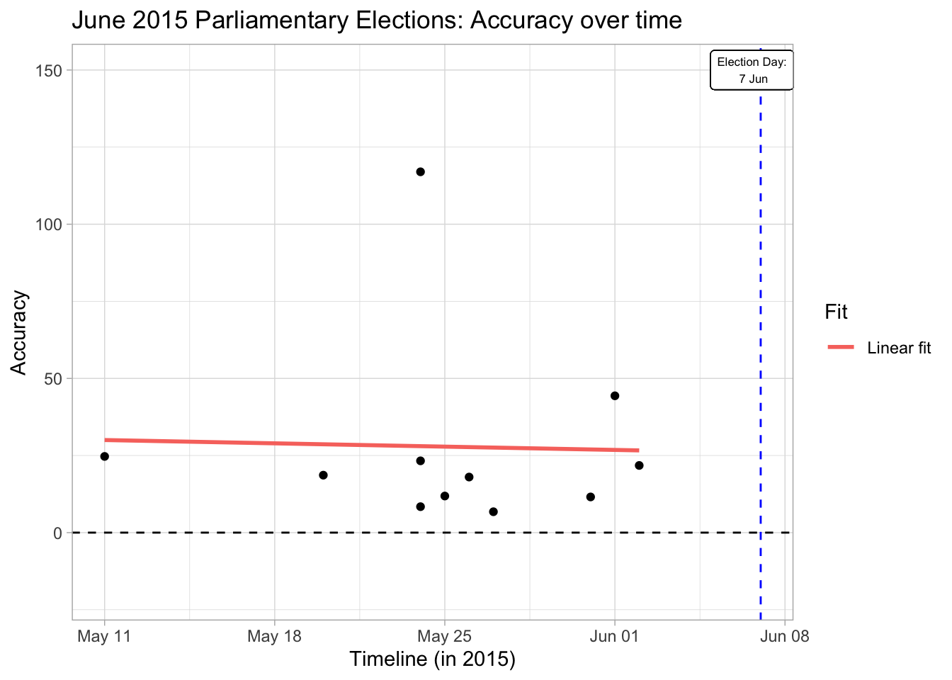
Accuracy Per Pollster
Finally, I hope to build a predictive model for the upcoming local elections' results using the results found by different pollster, so I thought that the historical performance of different pollsters will be a good reference point. For this ranking, I simply took the average of the firms' accuracy for the races they made predictions for.
june2015join <- june2015
june2015join$Pollster <- rownames(june2015join)
june2015join <- june2015join[,-(1:6)]

join1 <- full_join(accuracyPresidential[,-c(1,3)], june2015join, by = "Pollster")

November2015join <- November2015
November2015join$Pollster <- rownames(November2015)
November2015join <- November2015join[,-(1:6)]

pollster.accuracy <- full_join(join1, November2015join, by = "Pollster")

colnames(pollster.accuracy) <- c("Pollster", "Presidential2018", "June2015", "November2015")


pollster.accuracy1 <- as.matrix(pollster.accuracy[2:4])
pollster.accuracy$Average <- rowMeans(pollster.accuracy1, na.rm=T)
pollster.accuracy <- pollster.accuracy[-which(pollster.accuracy$Pollster == "Election"),]

pollster.avg.acc <- ldply(split(pollster.accuracy[c(1,5)], pollster.accuracy$Pollster), function(x){mean(x[,2])})

colnames(pollster.avg.acc) <- c("Pollster", "Average")
ggplot(data = pollster.avg.acc) +
geom_col(aes(x = reorder(Pollster, -Average, sum), y = Average, fill = Average)) +
coord_flip() +
ylab("Distance From Actual Result") +
xlab("Pollster")+
theme_light()+
scale_fill_gradient2(low="Green", high="red", mid = "Orange", midpoint = 210)+
labs(title = "Historic Average Accuracy Per Firm")+
guides(fill=guide_legend(title="Average Accuracy"))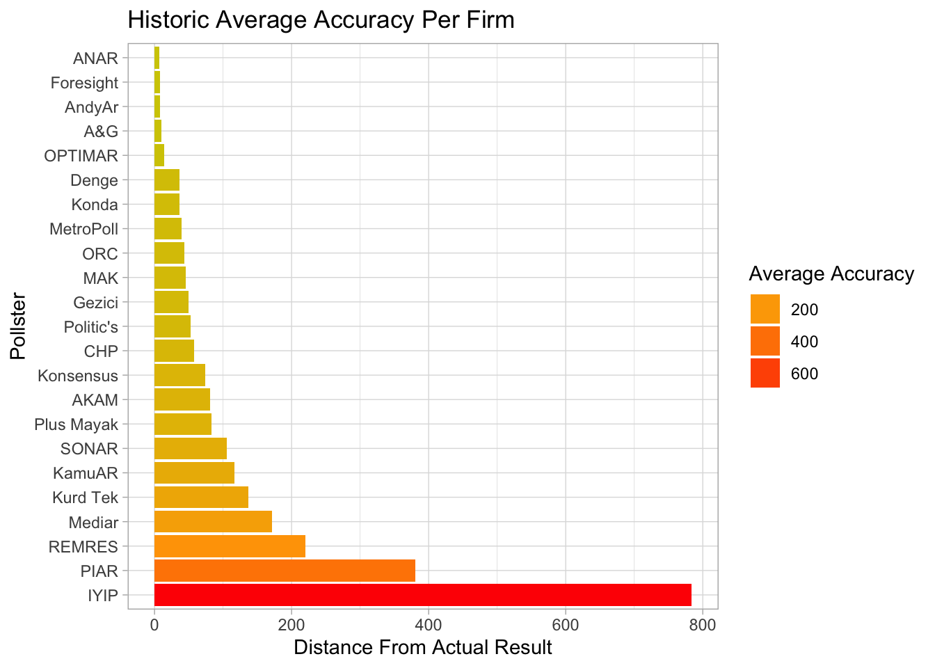
kable(pollster.avg.acc, caption = "Average accuracy per firm for the last 3 elections")| Pollster | Average |
|---|---|
| A&G | 10.44240 |
| AKAM | 80.83240 |
| ANAR | 6.77080 |
| AndyAr | 8.41280 |
| CHP | 58.09000 |
| Denge | 36.45160 |
| Foresight | 8.23000 |
| Gezici | 49.44707 |
| IYIP | 783.84000 |
| KamuAR | 116.99280 |
| Konda | 36.67573 |
| Konsensus | 74.32620 |
| Kurd Tek | 136.79440 |
| MAK | 45.97573 |
| Mediar | 170.93000 |
| MetroPoll | 39.43460 |
| OPTIMAR | 13.67000 |
| ORC | 43.46307 |
| PIAR | 380.90000 |
| Plus Mayak | 82.77000 |
| Politic's | 52.23000 |
| REMRES | 220.14500 |
| SONAR | 105.77573 |
Next steps
If I get time and more data in the future, I hope to improve the current ranking of pollsters. Simply averaging the accuracy results of each pollster without nessecarily accounting for time left until the election, the number of polls done by the pollster and the sample size used by the pollster, I admit, is a bit misleading.
I will probably get this partially done when I start predictive models as I would like to use some bayesian methods and such prior information can be quite relevant.