Marriage and Divorce in Turkey - Divorce
This second part was a lot more fun! More data was available and I also got to experiment with the gganimate package which is extremely cool. Make sure to not scroll fast over all the graph since there are some gifs!
As I said in the previous blog, this post is more focused on divorces and there was a little bit more data available (although I must admit the data is kind of noisy). Overall, I was very suprised to see no clear regional trends emerge. As opposed to the marriage dataset, it seems like the divorce dataset does not reflect the regional social trends as much. I guess this is not as suprising too since marriages with big age differences result in less divorces due to some of the intra-family dynamics (this is also clear in the data).
Divorce Reasons
First set of graphs illustrates the causes for divorces. A few clear and suprising trends:
- Maleficience and Dishonesty is going down quite fast (I have no clue why!)
- Discord has peaked shaply in 2010 and is now falling down fast. (something to deal with state policy?)
- Violence is increasing
Note that most of the divorces have “Unknown reasons” and the divorces that have a stated cause form an extremely small proportion of the of the dataset. Although one might still be able to make some statistical inferences about the general population even with this small sample size, I am hesitant due to the biases that might (and probably do exist) in the reporting of the causes of divorces.
library(tidyverse)
library(reshape2)
library(plyr)
library(stringr)
library(scales)
library(knitr)
library(data.table)
library(sp)
library(rgeos)
library(mgsub)
library(gridExtra)
library(ggrepel)
library(lmtest)
library(pander)
library(MASS)
library(lindia)
library(animation)
library(gganimate)
#Set-up the map
tr_to_en <- function(datafile){
turkish_letters <- c("Ç","Ş","Ğ","İ","Ü","Ö","ç","ş","ğ","ı","ü","ö")
english_letters <- c("C","S","G","I","U","O","c","s","g","i","u","o")
datafile <- mgsub(datafile,turkish_letters,english_letters)
return(datafile)
}
tur <- readRDS("../data/TR/TUR_adm1.rds")
cities <- tur@data[,c("NAME_1", "ID_1")]
colnames(cities)[2]<- "id"
cities[,2] <- as.character(cities[,2])
tur <- gSimplify(tur, tol=0.01, topologyPreserve=TRUE)
tur <- fortify(tur)
map <- left_join(tur, cities, by = "id")
map$NAME_1 <- tr_to_en(map$NAME_1)
map$NAME_1 <- gsub("K. Maras", "Kahramanmaras", map$NAME_1)
map$NAME_1 <- gsub("Kinkkale","Kirikkale", map$NAME_1)
map$NAME_1 <- gsub("Zinguldak", "Zonguldak", map$NAME_1)
map$NAME_1 <- gsub("Afyon","Afyonkarahisar", map$NAME_1)
colnames(map)[8] <- "City"#Divorce reasons dataset
divorceReason <- fread("../data/TR/evlilikSebep.csv",header = F)
translatedReasons <- c(rep("Mental Illness",17), rep(" Maleficience and Dishonesty", 17), rep("Abandonment", 17), rep("Life Threats and Violence", 17), rep("Discord", 17), rep("Unknown", 17), rep("Other", 17), rep( "Adultery", 17))
divorceReason[,1] <- translatedReasons
colnames(divorceReason) <- c("Reason", "Year", "Number of Divorces")#Create Graphs
ggplot(data = divorceReason) + geom_col(aes(x = Year, y = `Number of Divorces`, fill = Reason)) + facet_wrap(.~Reason, scales = "free") + guides(fill=FALSE) + geom_smooth(aes(x = Year, y = `Number of Divorces`), method = "loess",fill = NA) + ggtitle("Reasons for Divorces Over time in Turkey") +
theme(plot.title = element_text( family = "Arial", face = "bold", size = 10 ),
plot.subtitle = element_text( family = "Arial", size = 8 )) + theme_minimal()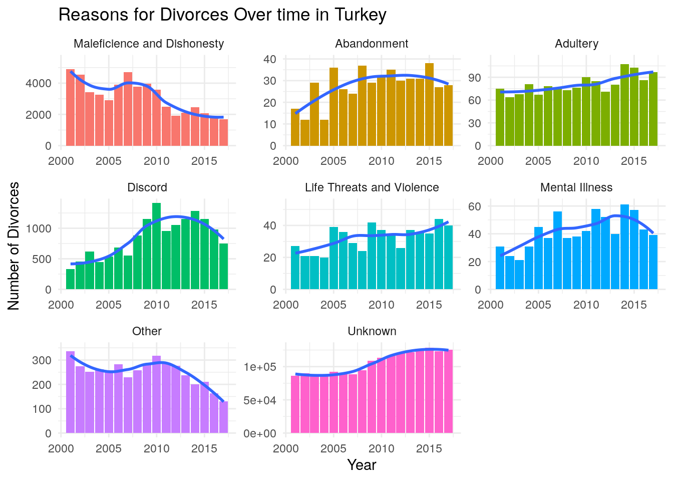
#Distribution per year graph
ggplot(data = divorceReason[Reason != "Unknown"]) + geom_bar(aes(x = Year, y = (..count..)/sum(..count..),weight = `Number of Divorces`, fill = Reason), position ="stack", stat = ) + ggtitle("What percentage does each reason make up per year in Turkey?", subtitle = "Excluding Divorces with 'Unknown reasons'") + theme(plot.title = element_text( family = "Arial", face = "bold", size = 10 ),
          plot.subtitle = element_text( family = "Arial", size = 8 )) + theme_minimal() + ylab("Number of Divorces")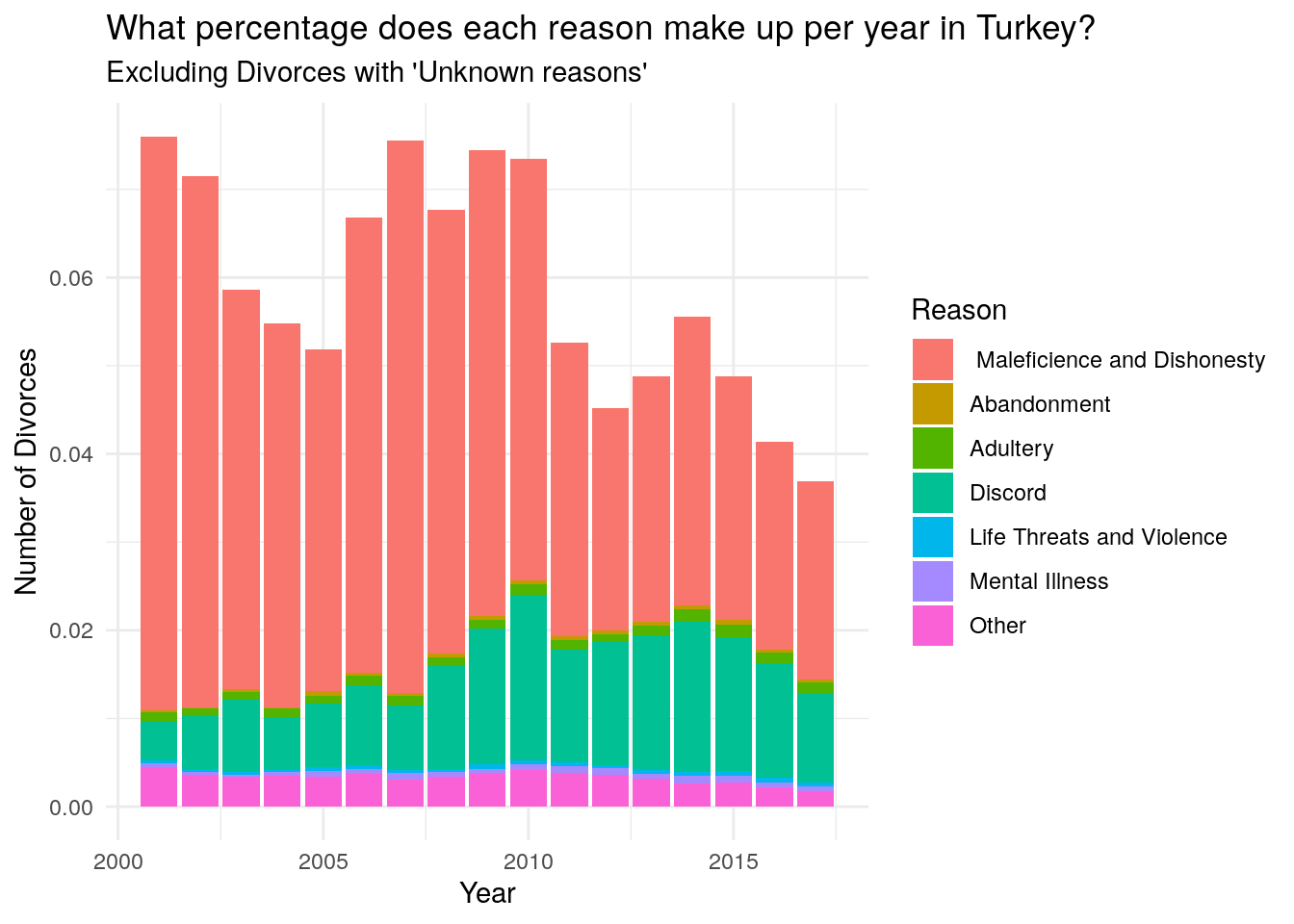
One interesting trend is that divorces have sharply increased after the 2008 financial crisis (although the consequences were not so severe in Turkey) and have plateau-ed around 2013.
agreData <- divorceReason[,sum(`Number of Divorces`),Year]


ggplot(data = divorceReason) + geom_point(aes(x = Year, y = `Number of Divorces`), stat = "summary", fun.y = "sum") + geom_smooth(data = agreData, aes(x= Year, y = V1),method = "loess", fill = NA) + ggtitle("The Number of Divorces is Increasing but Seems to Have Slowed Down") + theme(plot.title = element_text( family = "Arial", face = "bold", size = 10 ),
          plot.subtitle = element_text( family = "Arial", size = 8 )) + theme_minimal()  + ylab("Number of Divorces") + geom_vline(xintercept = 2008, color = "red", linetype = "dashed")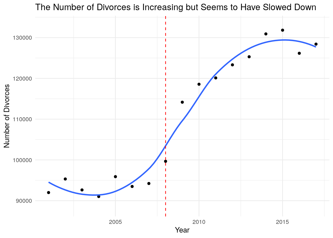
divorceAge <- fread("../data/TR/BosanmaYas.csv", encoding = "UTF-8")
colnames(divorceAge) <- c("Ages", "Year", "Number")

copy <- ""
for (i in 1:nrow(divorceAge)){
    if (divorceAge$Ages[i] != copy & divorceAge$Ages[i] != ""){
        copy = divorceAge$Ages[i]
    }
    else{
        divorceAge$Ages[i] <- copy
    }

}

divorceAge <- divorceAge[-(grep(x = divorceAge$Ages, pattern ="Bilinmeyen")),]
age.ranges <- str_extract_all(pattern = "[0-9]{2}-[0-9]{2}|[0-9]{2}\\+", string = divorceAge$Ages)
age.ranges <- data.table(matrix(unlist(age.ranges), ncol = 2, byrow = T))
divorceAge$Women <- age.ranges$V1
divorceAge$Men <- age.ranges$V2
divorceAge <- divorceAge[,-1]
divorceAge <- divorceAge[,c(1,4,3,2)]
divorceAge <- data.table(divorceAge)

ageWomen <- divorceAge[,c(1,3,4)]
ageWomen <- divorceAge[,.(Number = sum(Number)),.(Year,Women)]
ageWomen <- melt(ageWomen,c(1,3), variable.name = "Gender")
colnames(ageWomen)[c(2,4)] <- c("Number", "Age")
ageWomen <- ageWomen[,c(1,3,4,2)]

ageMen <- divorceAge[,c(1,3,4)]
ageMen <- divorceAge[,.(Number = sum(Number)),.(Year,Men)]
ageMen <- melt(ageMen,c(1,3), variable.name = "Gender")
colnames(ageMen)[c(2,4)] <- c("Number", "Age")
ageMen <- ageMen[,c(1,3,4,2)]

dataAge <- rbind(ageMen,ageWomen)
Ages at the Time of Divorce
I wanted to create the animation below to show clearly how women who get divorces are younger than men. The distributions for women are way more left-skewed than the ones for men. This is hard to interpret since this might also be because women get married at a younger age compared to men.
Finally, it is also interesting to see that the average age of divorce is getting bigger for both men and women. This is clear from how the distrbutions become less left-skewed for both genders over time. This trend is clearer in the next two graph.
# men <- ggplot(data = dataAge[dataAge$Gender == "Women"]) +
#     geom_col(aes(x= Age, y = Number, fill = factor(Year))) +
#     geom_smooth(aes(x= Age, y = Number, group = factor(Year)), color = "black", method = "loess", fill = NA, size = 0.7) +
#     facet_wrap(~Year) +
#     theme_bw() +
#     theme(axis.text.x=element_blank(),
#               axis.text.y=element_blank(),
#           plot.title = element_text( family = "Arial", face = "bold", size = 10 ),
#           plot.subtitle = element_text( family = "Arial", size = 8 ))  +
#     guides(fill = F, color = F) +
#     labs(title = "Distribution of the Ages of Women at Divorce", subtitle = "LOESS fit in Black") +
#     ylab("Number of Divorces") +
#     xlab("Age groups from 16 to 60+")
#
# women <- ggplot(data = dataAge[dataAge$Gender == "Men"]) +
#     geom_col(aes(x= Age, y = Number, fill = factor(Year))) +
#     geom_smooth(aes(x= Age, y = Number, group = factor(Year)), color = "black", method = "loess", fill = NA, size = 0.7) +
#     facet_wrap(~Year) +
#     theme_bw() +
#     theme(axis.text.x=element_blank(),
#               axis.text.y=element_blank(),
#           plot.title = element_text( family = "Arial", face = "bold", size = 10 ),
#           plot.subtitle = element_text( family = "Arial", size = 8 ))  +
#     guides(fill = F, color = F) +
#     labs(title = "Distribution of the Ages of Men at Divorce", subtitle = "LOESS fit in Black") +
#     ylab("Number of Divorces") +
#     xlab("Age groups from 16 to 60+") + ylim(c(-2300,max(dataAge[dataAge$Gender == "Men"]$Number)+10))
#

ggplot(data = dataAge) +
    geom_col(aes(x= Age, y = Number, fill = factor(Year))) +
    geom_smooth(aes(x= Age, y = Number, group = factor(Year)), color = "black", method = "loess", fill = NA, size = 0.7) +
    facet_wrap(~Year) +
    theme_bw() +
    theme(axis.text.x=element_blank(),
              axis.text.y=element_blank(),
          plot.title = element_text( family = "Arial", face = "bold", size = 10 ),
          plot.subtitle = element_text( family = "Arial", size = 8 ))  +
    guides(fill = F, color = F) +
    labs(title = "Distribution of the Ages of {closest_state} at Divorce", subtitle = "LOESS fit in Black") +
    ylab("Number of Divorces") +
    xlab("Age groups from 16 to 60+") +
    ylim(c(-2300,max(dataAge[dataAge$Gender == "Men"]$Number)+10)) +
    transition_states(states = factor(Gender), state_length = 2 ) +
    ease_aes('linear')
## Warning: No renderer available. Please install the gifski, av, or magick package
## to create animated output## NULLI was initially going to create an animation for all the graphs below however, after I created the animation, I realized that the joint distribution looked very similar from one year to another and that the animation looked like a still image. This is also indicative of how the distributions of the ages of divorces for both men and women are becoming less left-skewed. This is interesting since it shows that the increase of divorces at an older age is not a gender-dependent trend.
 ggplot(data = divorceAge[divorceAge$Year %in% 2001:2009]) + geom_count(aes(x= Men, y = Women, color = Number, size = Number)) +
    scale_color_gradient(low = "plum3", high = "firebrick1", guide =FALSE) +
    ggtitle("Distribution of the Ages of the Men and Women at the Time of their Divorce") +
    facet_wrap(~Year)+
    theme(axis.text.x=element_text(angle = 90, size = 6),
          axis.text.y=element_text(size = 6),
          plot.title = element_text( family = "Arial", face = "bold", size = 10 ),
          plot.subtitle = element_text( family = "Arial", size = 8 ))+
    guides(size=guide_legend(title="Number of Divorces"))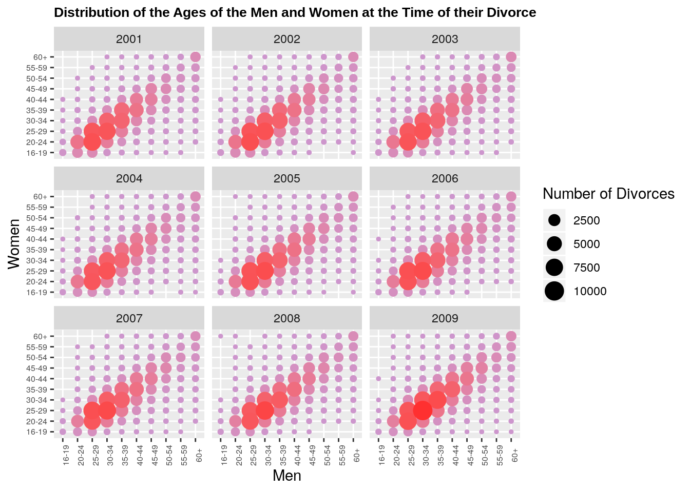
ggplot(data = divorceAge[!(divorceAge$Year %in% 2001:2009)]) + geom_count(aes(x= Men, y = Women, size = Number, color = Number)) +
    guides(color = F) +
    scale_color_gradient(low = "plum3", high = "firebrick1", guide =FALSE) +
    ggtitle("Distribution of the Ages of Men and Women at the Time of their Divorce") +
    facet_wrap(~Year)+
    theme(axis.text.x=element_text(angle = 90, size = 6),
          axis.text.y=element_text(size = 6),
          plot.title = element_text( family = "Arial", face = "bold", size = 10 ),
          plot.subtitle = element_text( family = "Arial", size = 8 ))+
    guides(size=guide_legend(title="Number of Divorces")) + ylab("Women's age at the time of Divorce") + xlab("Men's Age at the time of Divorce")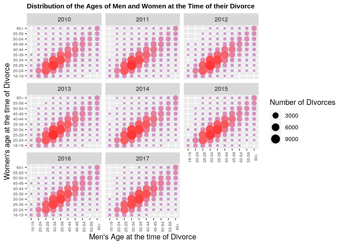
ageDiff <- fread("../data/TR/BosanmaYasFarkiIl.csv")
ageDiff<- ageDiff[,-1]
ageDiff<- ageDiff[-1,]
ageDiff<- ageDiff[-(2:3),]
ageDiff<- ageDiff[,-85]
nationalAgeDiff <- ageDiff[,c(1,2,72)]
ageDiff <- ageDiff[, -72]
colnames(ageDiff) <-  c("age.diff","Year","Adana", "Adiyaman", "Afyonkarahisar", "Aksaray", "Amasya", "Ankara", "Antalya", "Ardahan", "Artvin", "Aydin", "Agri", "Balikesir", "Bartin", "Batman", "Bayburt", "Bilecik", "Bingol", "Bitlis", "Bolu", "Burdur", "Bursa", "Denizli", "Diyarbakir", "Duzce", "Edirne", "Elazig", "Erzincan", "Erzurum", "Eskisehir", "Gaziantep", "Giresun", "Gumushane", "Hakkari", "Hatay", "Isparta", "Igdir", "Kahramanmaras", "Karabuk", "Karaman", "Kars", "Kastamonu", "Kayseri", "Kilis", "Kocaeli", "Konya", "Kutahya", "Kirklareli", "Kirikkale", "Kirsehir", "Malatya", "Manisa", "Mardin", "Mersin", "Mugla", "Mus", "Nevsehir", "Nigde", "Ordu", "Osmaniye", "Rize", "Sakarya", "Samsun", "Siirt", "Sinop", "Sivas", "Tekirdag", "Tokat", "Trabzon", "Tunceli", "Usak", "Van", "Yalova", "Yozgat", "Zonguldak", "Canakkale", "Cankiri", "Corum", "Istanbul", "Izmir", "Sanliurfa", "Sirnak")
ageDiff <- ageDiff[-1,]


copy <- ""
for (i in 1:nrow(ageDiff)){
    if (ageDiff$age.diff[i] != copy & ageDiff$age.diff[i] != ""){
        copy = ageDiff$age.diff[i]
    }
    else{
        ageDiff$age.diff[i] <- copy
    }
}
ageDiff <- ageDiff[-grep(pattern = "Eşlerin yaş farkı:Bilinmeyen", x = ageDiff$age.diff),]
ageDiff <- ageDiff[-grep(pattern = "Eşlerin yaş farkı:Damadın Yaşı Küçük", x = ageDiff$age.diff),]

ages <- ageDiff$age.diff
ages <- str_replace_all(string = ageDiff$age.diff, pattern = "Eşlerin yaş farkı:Yaşları Eşit", replacement = "0")
ages <- unlist(str_extract_all(string = ages, pattern = "[0-9]{1,2}"))


ageDiff$age.diff <- ages
ageDiff <- data.table(ageDiff)
ageDiff <- ageDiff[, lapply(.SD, as.numeric)]
ageDiff <- melt(ageDiff, id.vars = 1:2, variable.name = "City")
ageDiff <- data.table(ageDiff)
ageDiff <- na.omit(ageDiff)


weightedAverage <- function(df) {
    n <- sum(df$value)
    return((t(df[,"age.diff"]) %*% df[,"value"])/n )
}

avg.city <- ddply(ageDiff, .(Year,City), weightedAverage)
avg.city[,3] <- replace_na(avg.city[,3], replace = 0)
colnames(avg.city)[3] <- "Age Difference"


nationalAgeDiff <- nationalAgeDiff[-1,]
colnames(nationalAgeDiff)  <- c("age.diff", "Year", "value")

copy <- ""
for (i in 1:nrow(nationalAgeDiff)){
    if (nationalAgeDiff$age.diff[i] != copy & nationalAgeDiff$age.diff[i] != ""){
        copy = nationalAgeDiff$age.diff[i]
    }
    else{
        nationalAgeDiff$age.diff[i] <- copy
    }
}

nationalAgeDiff <- nationalAgeDiff[-grep(pattern = "Eşlerin yaş farkı:Bilinmeyen", x = nationalAgeDiff$age.diff),]
nationalAgeDiff <- nationalAgeDiff[-grep(pattern = "Eşlerin yaş farkı:Damadın Yaşı Küçük", x = nationalAgeDiff$age.diff),]

ages <- nationalAgeDiff$age.diff
ages <- str_replace_all(string = nationalAgeDiff$age.diff, pattern = "Eşlerin yaş farkı:Yaşları Eşit", replacement = "0")
ages <- unlist(str_extract_all(string = ages, pattern = "[0-9]{1,2}"))
nationalAgeDiff$age.diff <- as.numeric(ages)
nationalAgeDiff$value <- as.numeric(nationalAgeDiff$value)

nationalAgeDiff <- ddply(nationalAgeDiff, "Year", weightedAverage)
colnames(nationalAgeDiff)[2] <- "Age Difference"
The map below shows the age difference between the spouses for each region. The animation really makes it clear that there are no clear regional trends for divorces even when studying the age of the spouses. Regions that have big age differences one year can have very small ones the next year. However, it seems like the aegean region has an overall high age difference.
Finally, the animation below shows how the average age difference between spouses varies accross regions. Both animations show clearly that regional difference explain very little of the variation in age difference at the time of divorce.
data <- left_join(map, avg.city, by = "City")## Warning: Column `City` joining character vector and factor, coercing into
## character vectorseq <- 360/(2*pi)*rev( pi/2 + seq( pi/81, 2*pi-pi/81, len=81))
ggplot(data = avg.city) + geom_col(aes(x = City, y = `Age Difference`)) +
geom_hline(aes(yintercept = `Age Difference`), data = nationalAgeDiff, color = "red") +
theme_bw() +
theme(axis.line=element_blank(),
axis.text.x = element_text(angle = seq, size = 6, vjust = 1),
axis.text.y=element_blank(),
axis.ticks=element_blank(),
axis.title.x=element_blank(),
axis.title.y=element_blank(),
panel.grid.minor=element_blank(),
plot.title = element_text( family = "Arial", face = "bold", size = 10),
plot.margin=unit(c(1,0,-4.5,0), "cm")) +
coord_polar(theta = "x", start = 0, direction=1) +
transition_states(Year,state_length = 4) +
labs(title = "Average Age Difference Between the Parties Getting Divorced in {closest_state}", subtitle = "Red line represents national average")## NULLggplot(data = data) +
geom_polygon(aes(x= long, y =lat, group = group, fill = `Age Difference`)) +
guides(fill = guide_legend(title = "Age Difference")) +
theme(legend.box.margin = margin(c(1,10,1,1))) +
scale_fill_distiller(palette = 11, direction = 1) +
coord_fixed(1.3) + theme_bw() +
theme(axis.line=element_blank(),axis.text.x=element_blank(),
axis.text.y=element_blank(),axis.ticks=element_blank(),
axis.title.x=element_blank(),
axis.title.y=element_blank(),
panel.grid.minor=element_blank(),
plot.title = element_text( family = "Arial", face = "bold", size = 10 )) +
labs(title = "Average Age Difference Between the Parties Getting Divorced in {closest_state}") + transition_states(Year, state_length = 2) ## Warning: No renderer available. Please install the gifski, av, or magick package
## to create animated output## NULLNext Steps
I am urrently working on an idea for the next post. It will most likely be about election forecasting or economic trends Not sure, really depends what data I can get my hands on! I might also do a post on some statistical/algorithmic problem as I have been working a lot on those lately.
Drop me a line, if you have an interesting dataset or idea you would like me to write a post about!